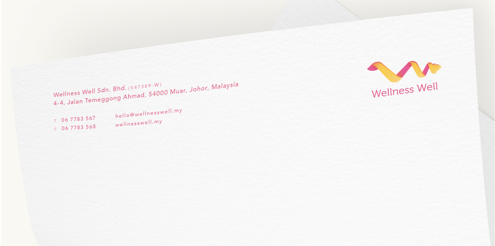
Wellness Well Branding
Our client's goal was to create a space where tired business people go to rest for short periods of time. As we approached the job, we learned the values of the brand, which were:—a shelter to take a breather, exclusive and assuringly reliable, trustworthy and caring, & like someone you can share your secrets with.
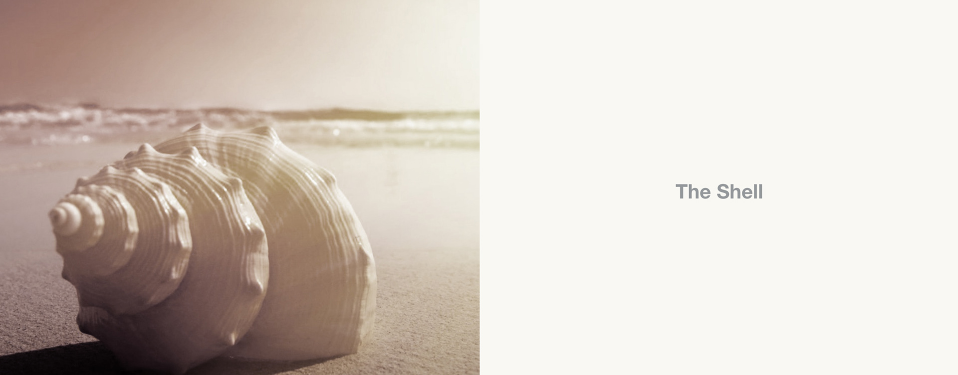
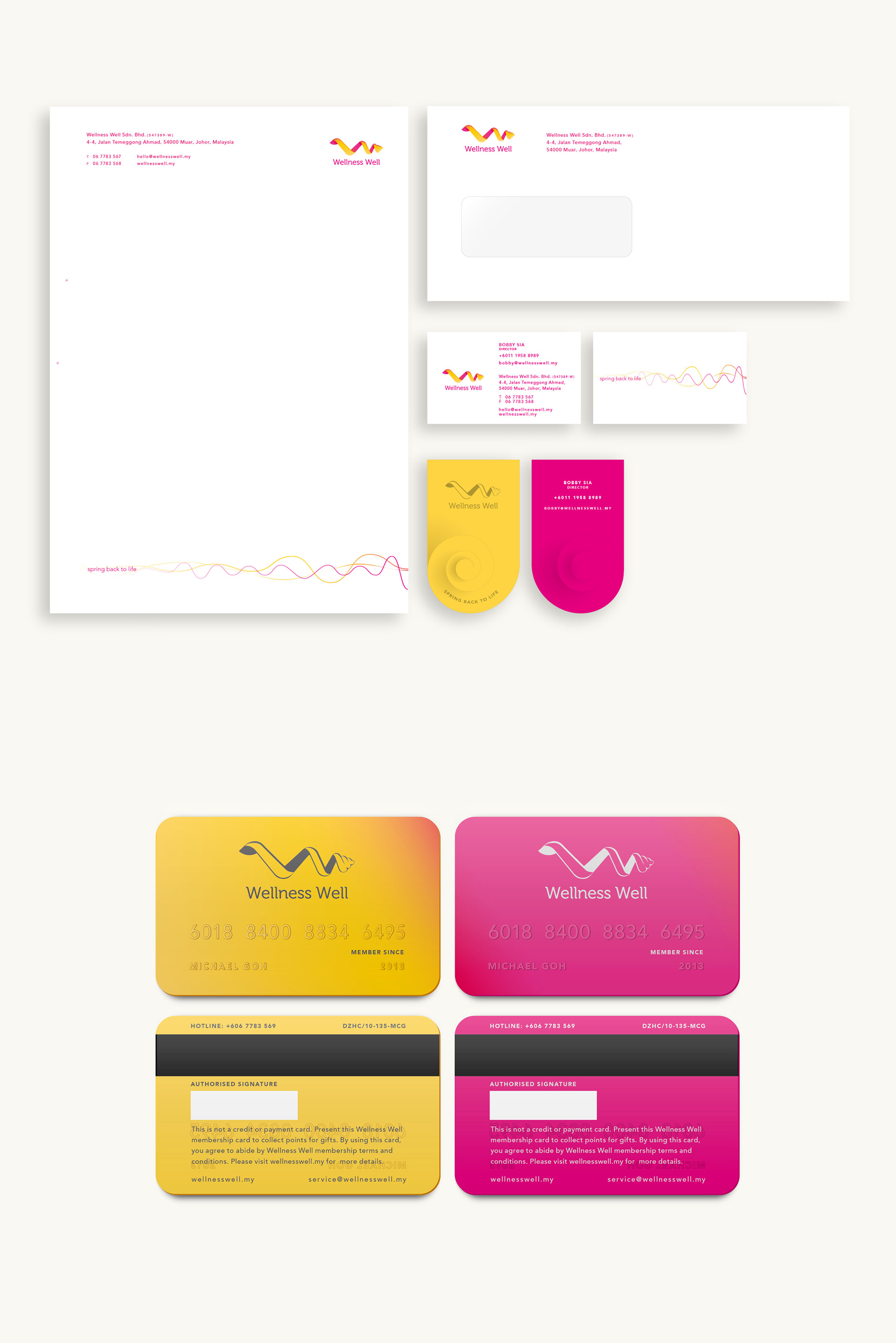
Wellness Well is a place, closed but open, open but closed. A brand that focused the wellness of its people. In our findings, shell represents the kind of shelter. The shell is also references in many religions as a symbol of journey through life. When we are stressed, we can go to this place to unwind. Thus, we can bounce back to who we are.
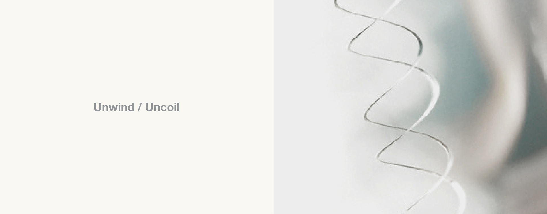
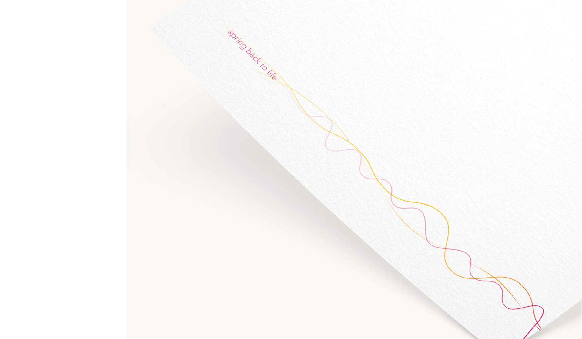
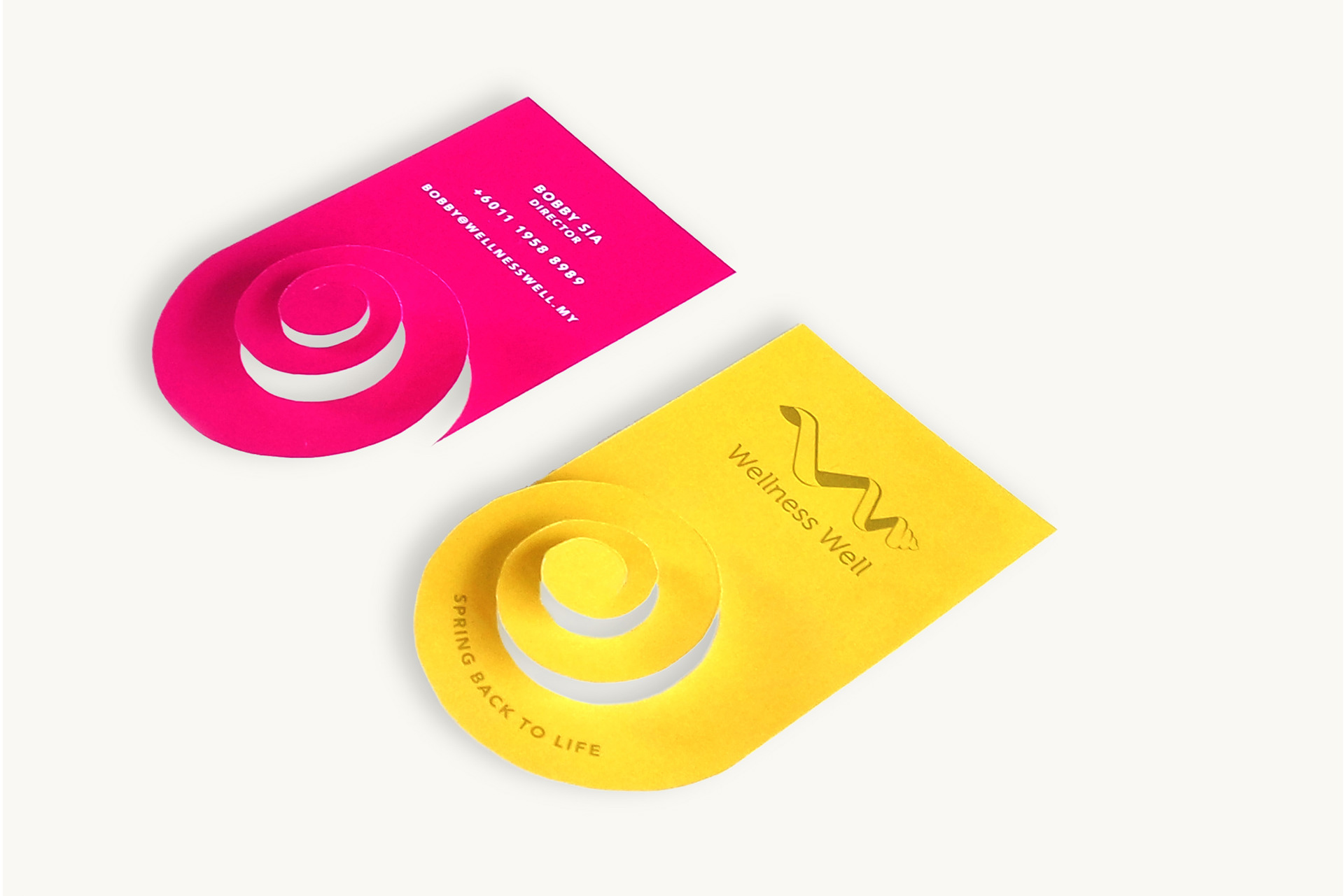
And thus, the key message was simple and clear, Wellness Well can help you 'unwind & uncoil' so you can 'Spring back to life'.
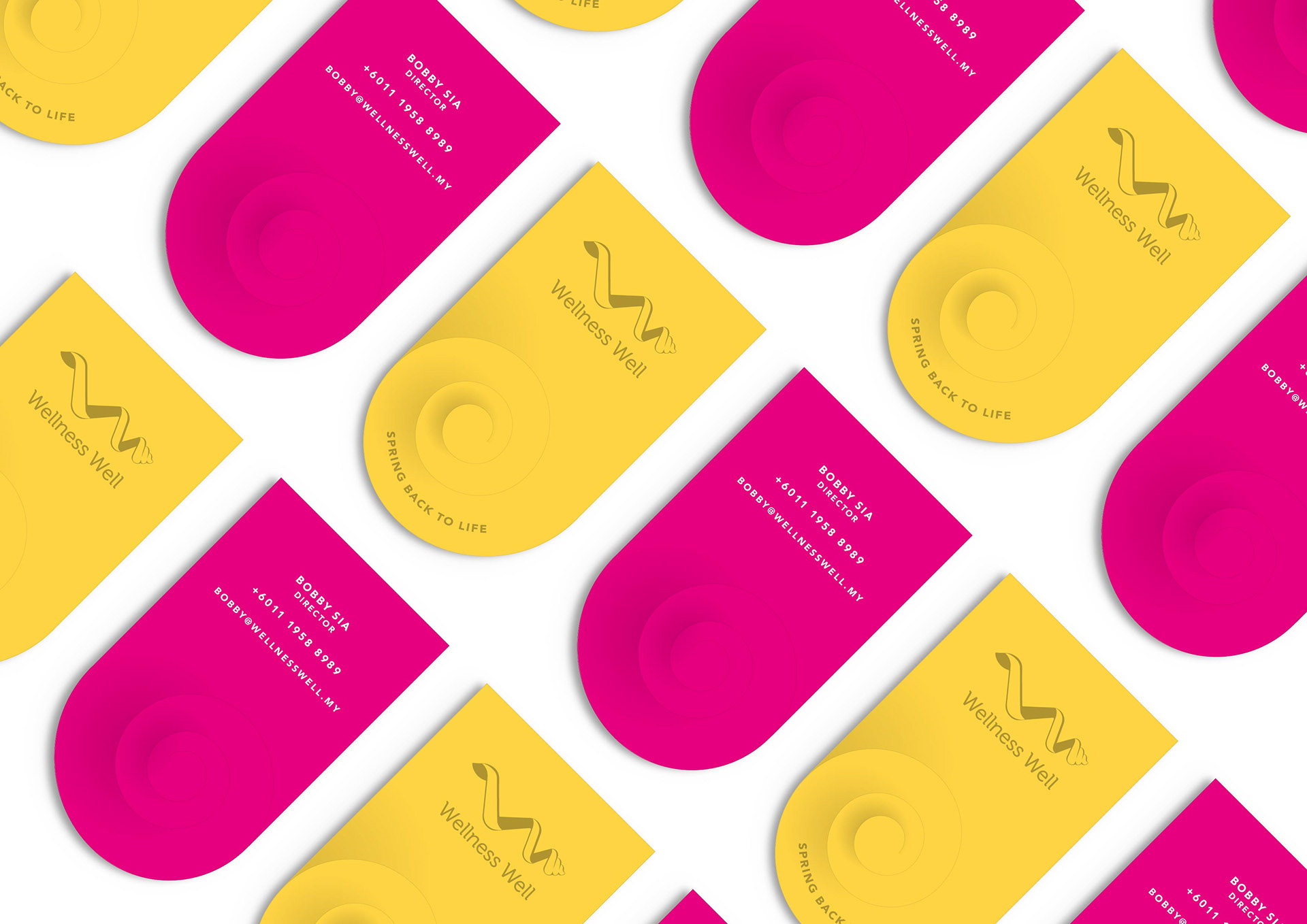
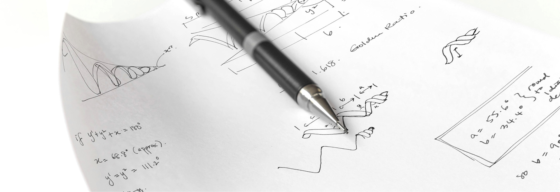
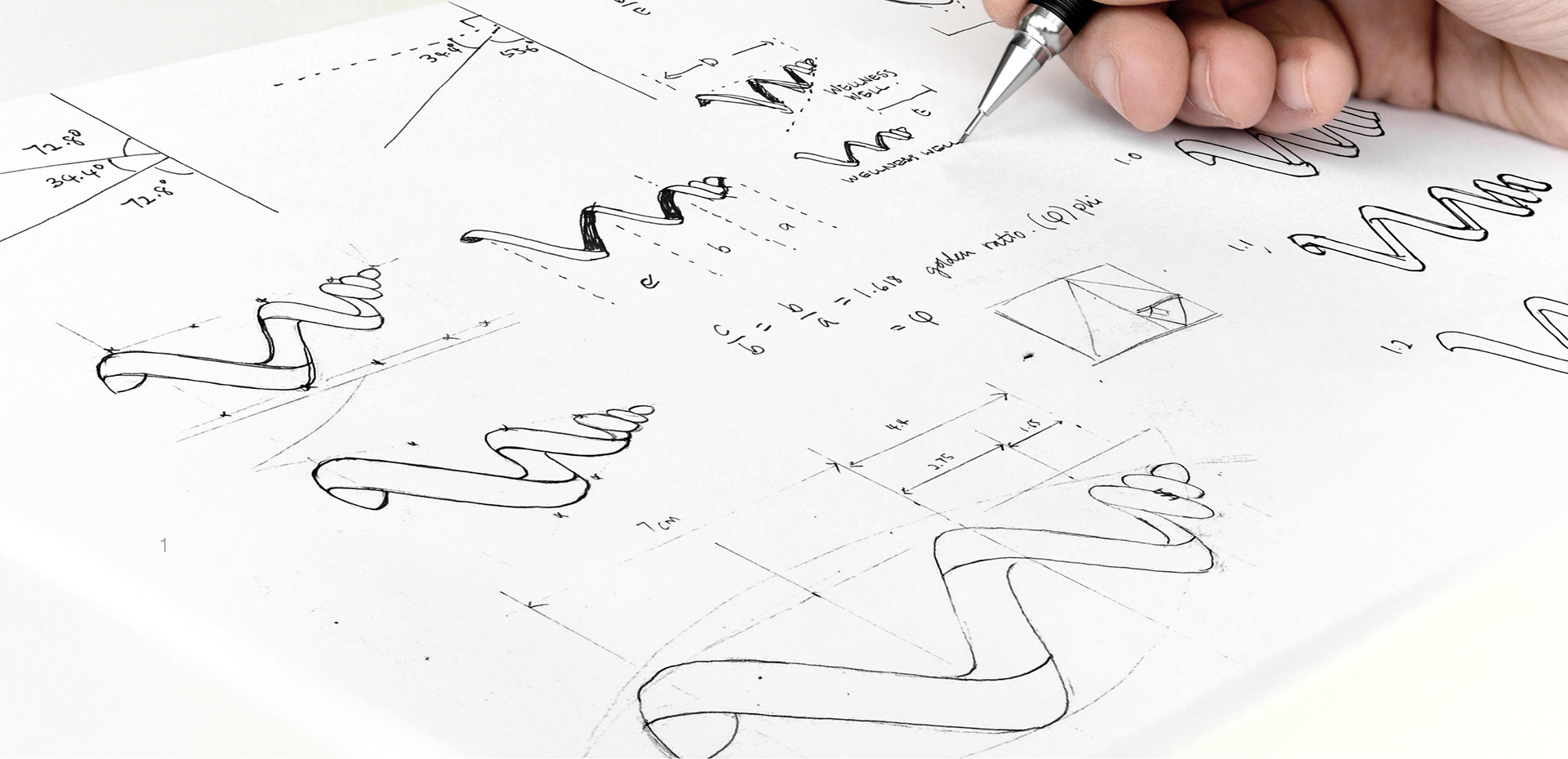
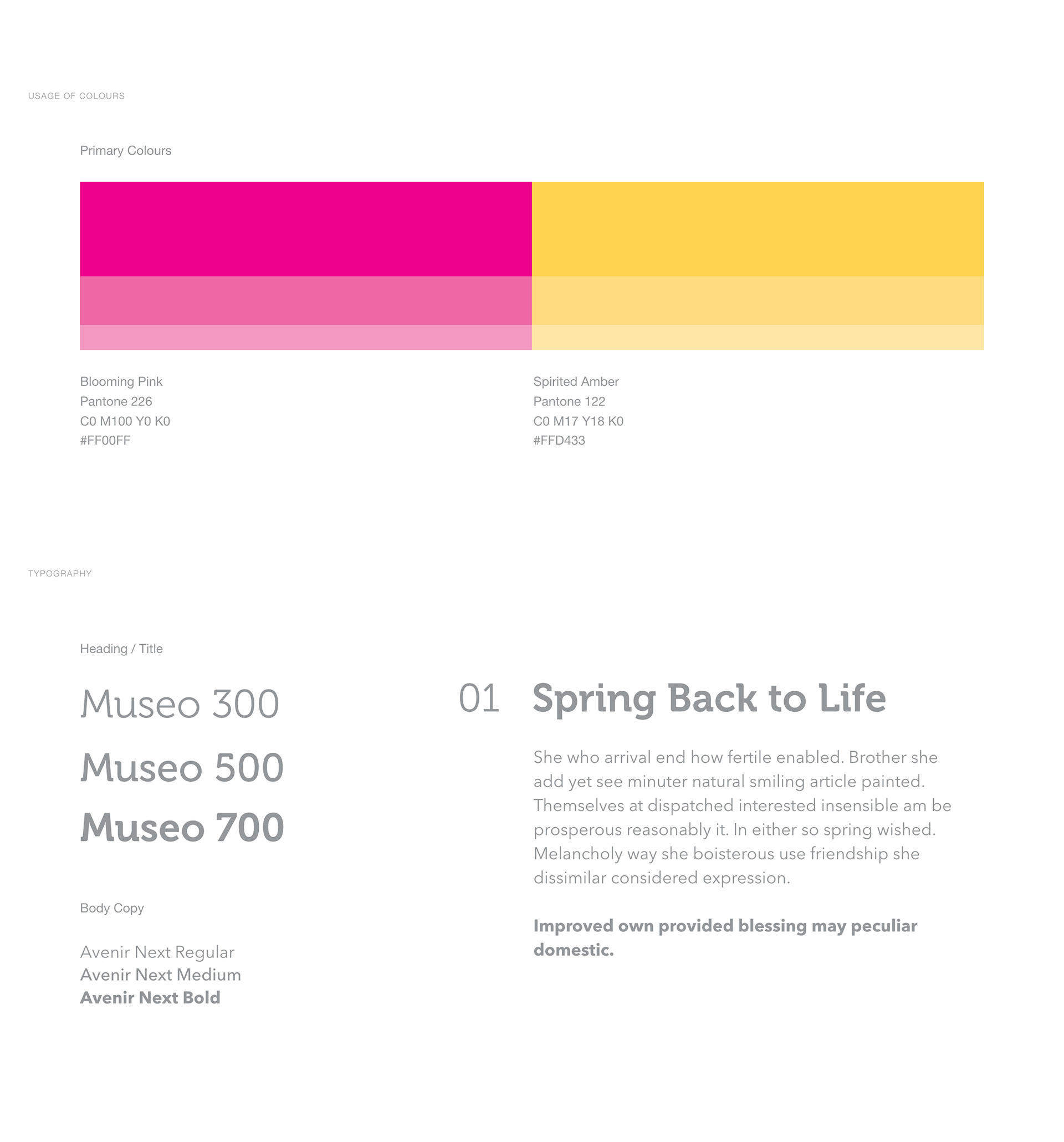
Our solution was simple, we used the alphabet, “W” to form a visual of a spring. To enhance it visually, nature's code of beauty (both golden ratio and golden triangle) was applied to the logo, making it mathematically beautiful, modern yet timeless, minimal and meaningful. Museo, a modern font was used to complete the look. Thus, the logo appears technical and futuristic, and conveys as energetic sense life.
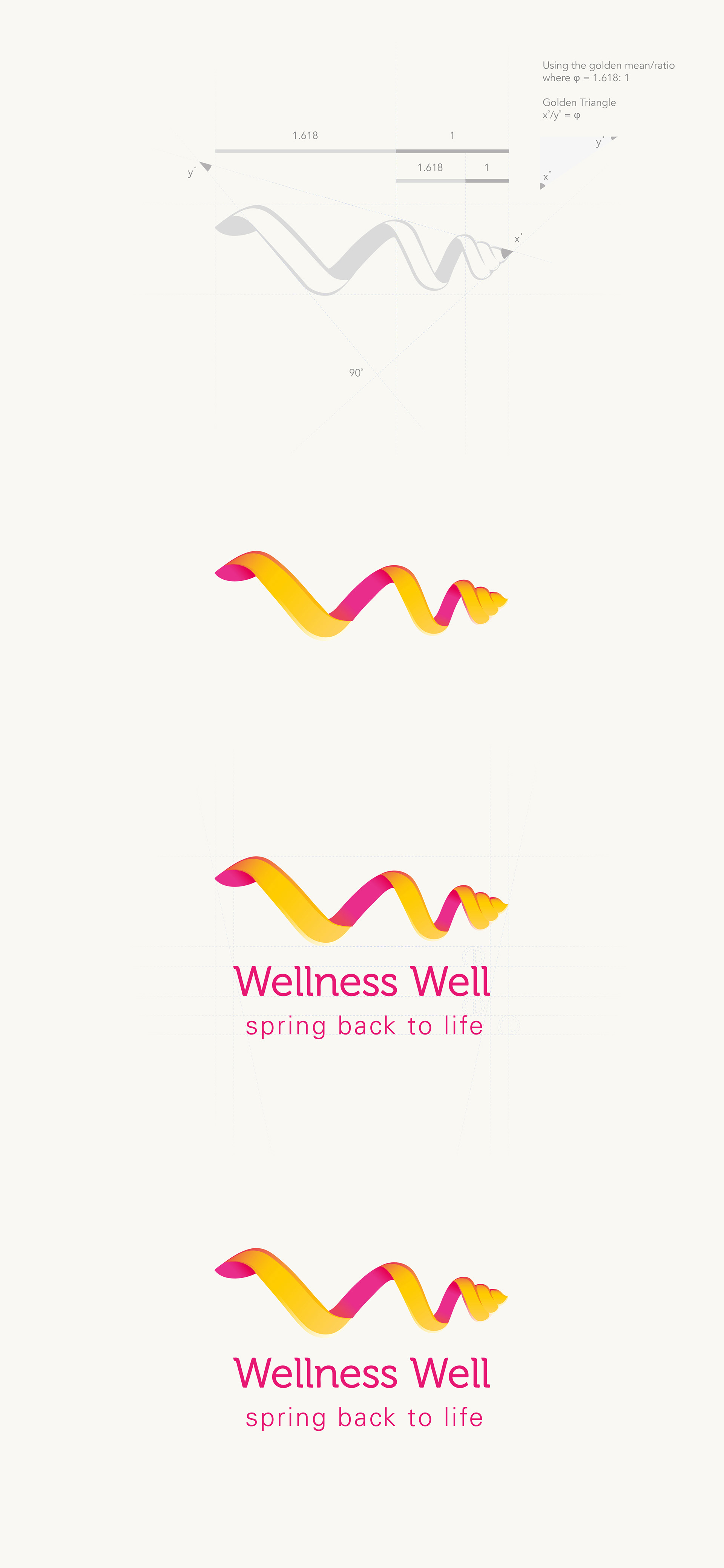
The selected colours of blooming pink and spirited amber, represents health, happiness, rebirth and an energetic, making the brand bright and exciting. And all these suit the brand philosophy perfectly.
Project Date
October 2013
Creative Director
Michael Goh
Team
Pooi Tung
Angel Oo