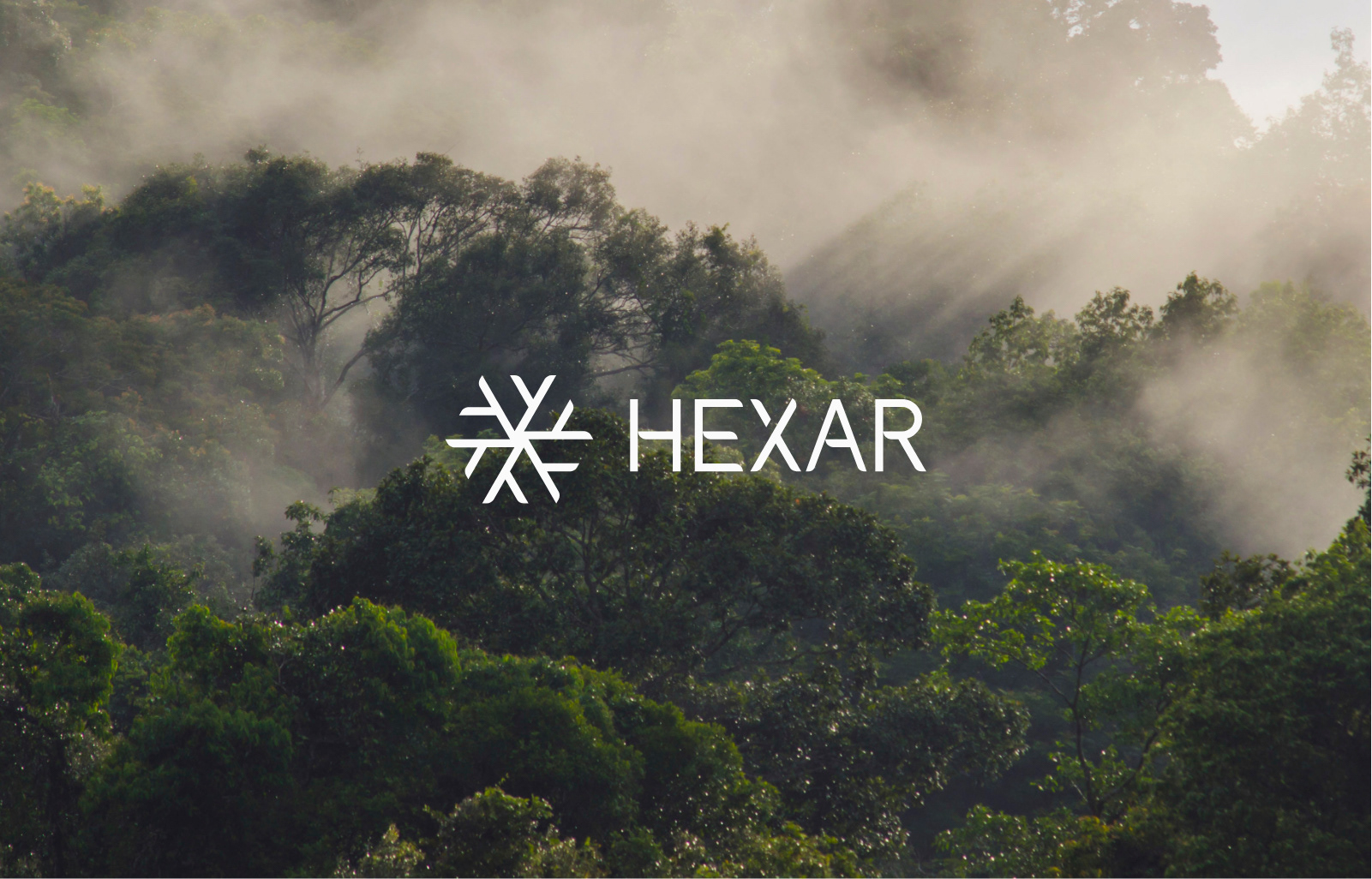
Hexar
Branding + Website
Our client was a property developer. Their belief was that building and constructing structures where people will call their homes is more than just that. Their brand was to be about 'more than a house - to be a home'. So we looked to nature for inspiration.
The foundation of the concept revolves around the idea of ‘balance’, and centres around people and their lives. The concept gave birth to a working conceptual line “Balancing Life’s Ideals”.
The foundation of the concept revolves around the idea of ‘balance’, and centres around people and their lives. The concept gave birth to a working conceptual line “Balancing Life’s Ideals”.
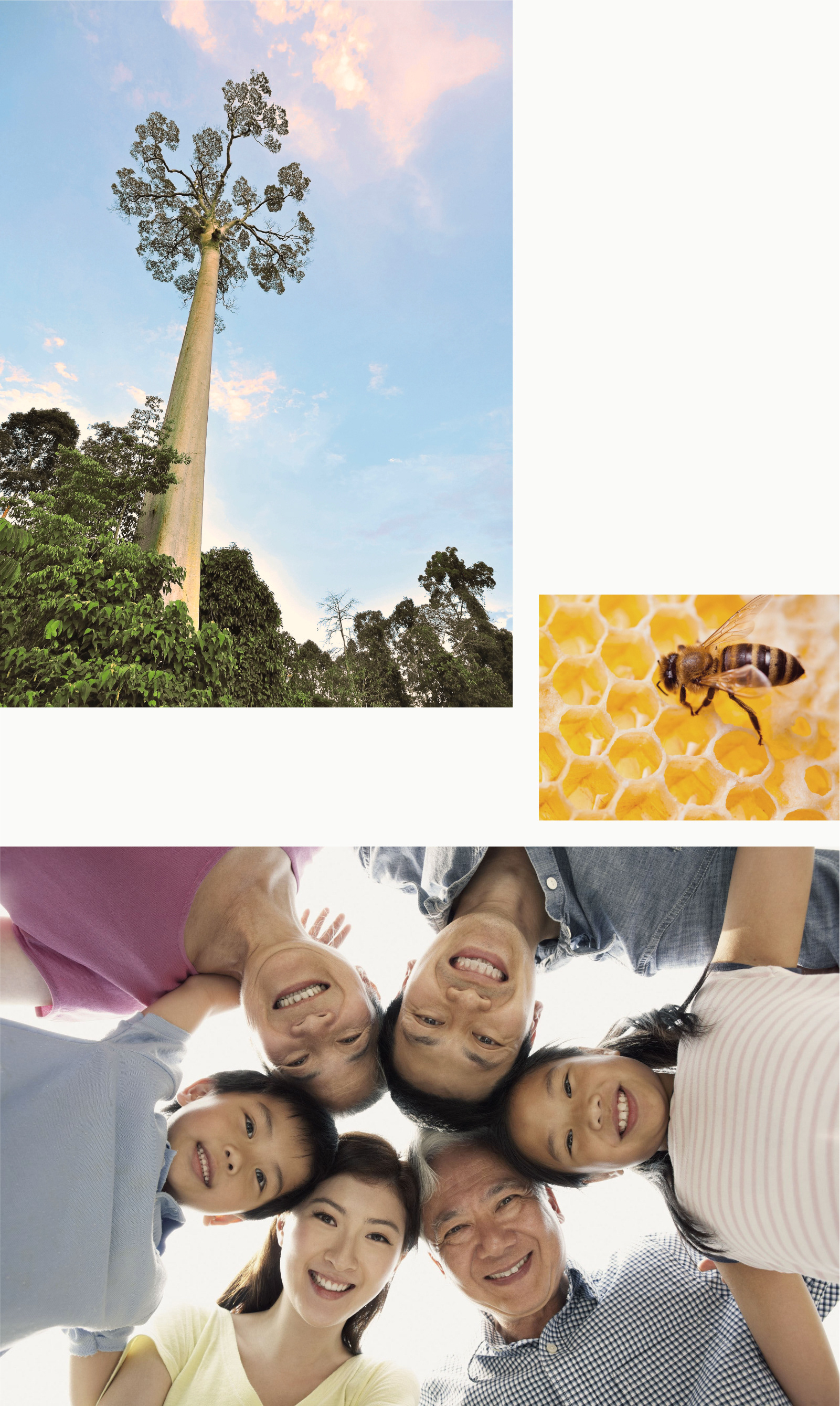
While collaborating with the client on research the seed was that the company and brand was to be about building homes, not just houses; we began our journey looking at a very special tree called Tembusu. This led us to another tree called “Tualang” – very tall trees which exist in Malaysia and Indonesia – which are often homes to giant honey bees.
Our search in this area led us to draw the parallels between the ideals of the company and brand with the ideals presented to us by nature. Balance in the ecosystem, with each unit contributing in a symbiotic relationship, inspired us to pursue this path.

Tualang Tree Facts – tallest measured 80+ metres tall. Branches grow above the canopy. Smooth bark that bears find difficult to climb. Tree sap causes skin irritation.
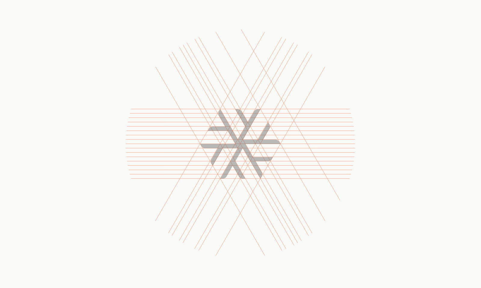
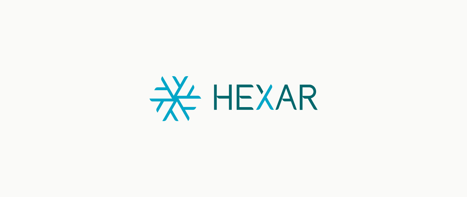
We focused on the hexagon shape of the honeycomb as our starting form. The hexagon is said to be nature’s most efficient space saving shape. As property and land development was their core business, it was a clear choice. And thus the name ‘Hexar’ was born from this inspiration.
With people in the core of their interest, the concept solidified and it made perfect sense to represent the brand centering around human collaboration and balance. Thus the search pointed us to one clear path. The solution was simple and elegant.
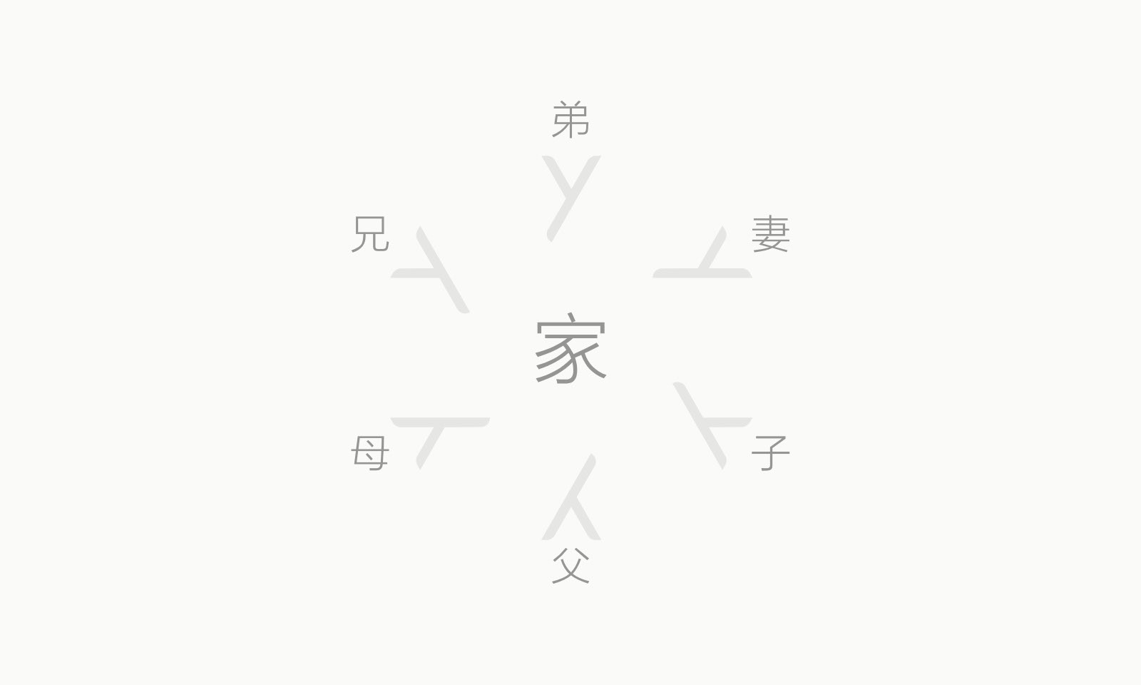
Hence, the form factor of our brand mark was clearly defined by our journey and research. The human element represented by the chinese character “Ren”, revolving around each other to form a hexagon. The six axes of the snowflake appearance is symbolic of the symbolises the 6 types of relationships in the family.
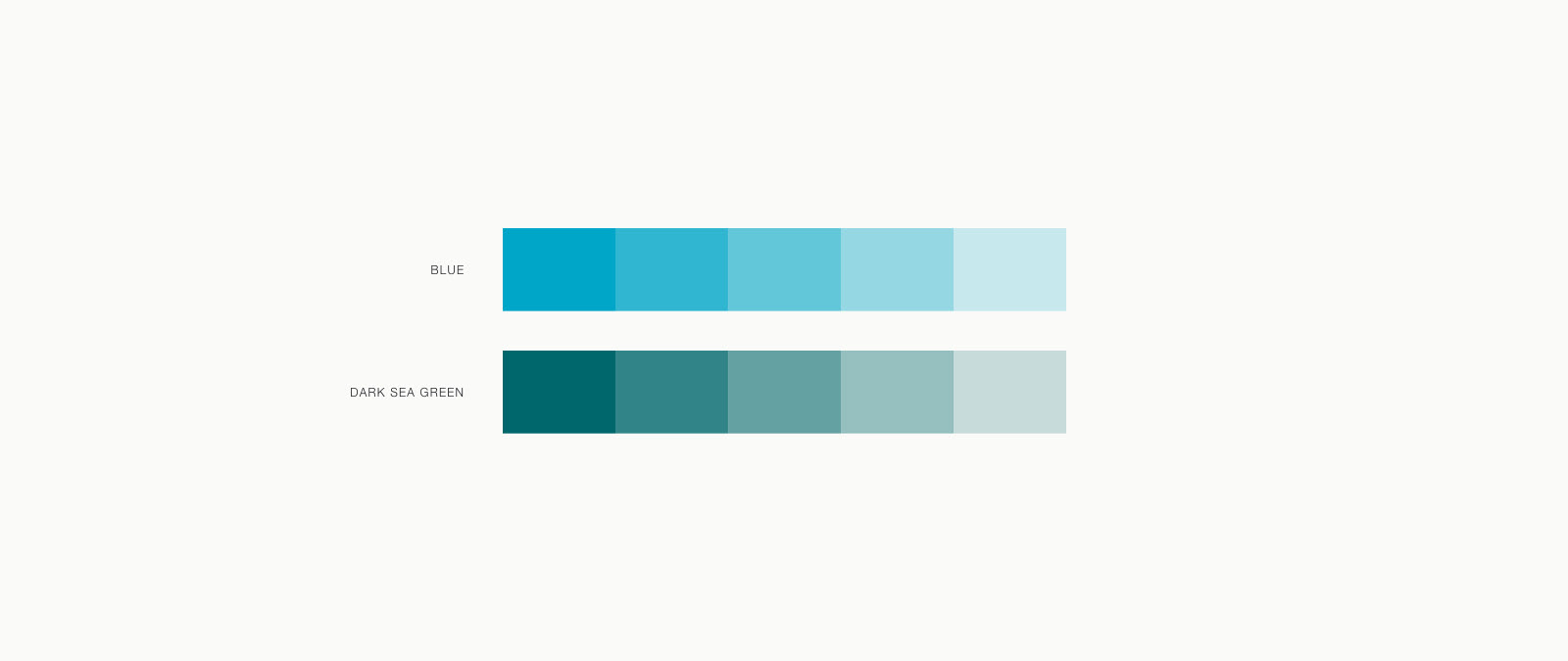
The primary brand colours in the Hexar logo is blue and dark sea green. Blue gives the idea of trustworthy and value loyalty in others and stability. It has the sense of calm and balancing.
Dark sea green is the colour of nature. It symbolises growth, harmony and fertility. It makes people feel safe and create a better place for others. When these two colours are combined, it indicates the strength and authority, responsibility and trust. It features the idea of balance and harmony.
The Logo
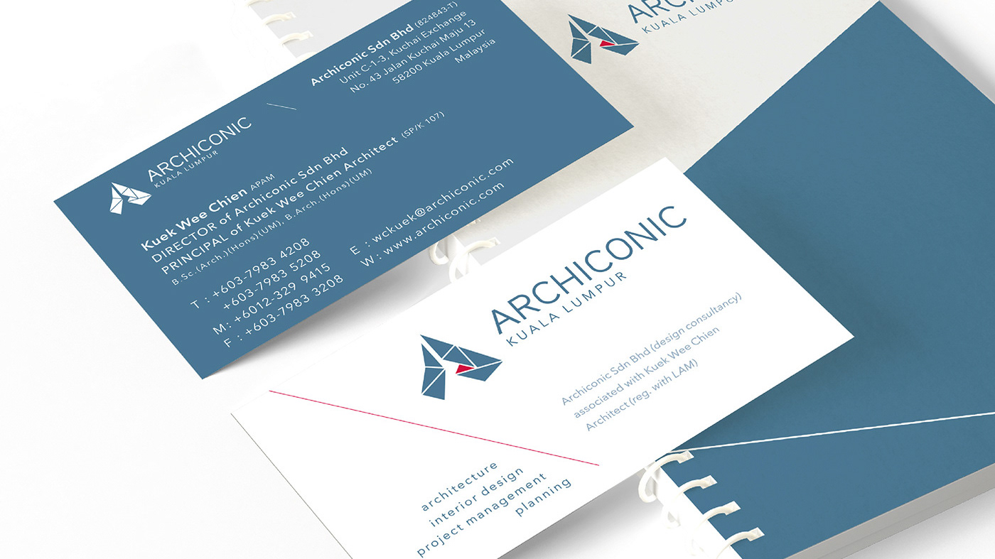
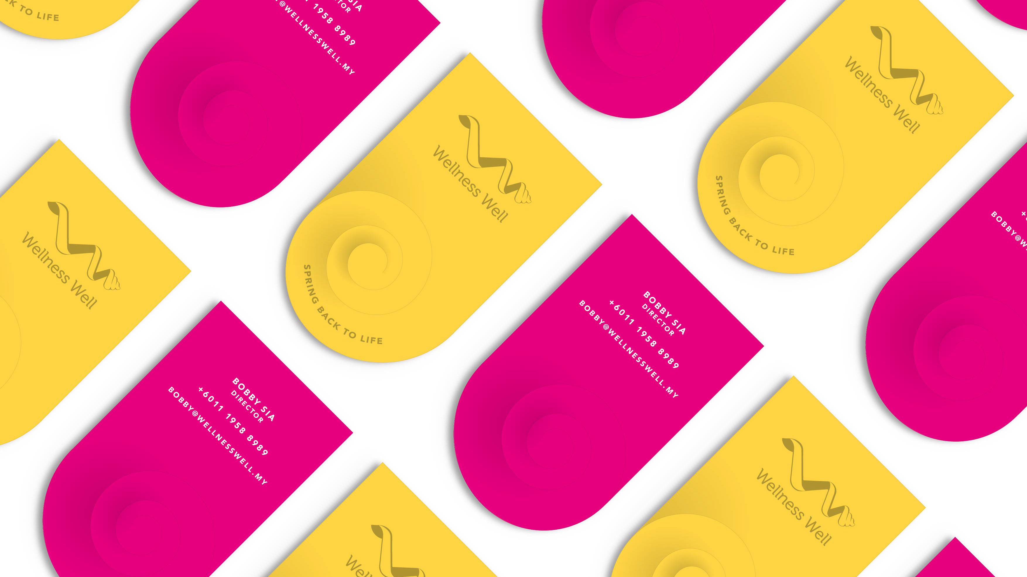
Corporate Identity
Stationery
Imagery Style

Website
Home Page
Projects Page
Profile Page
Invest Page
Project Date
June 2016
Team
Michael Goh
Pooi Tung
Angel Oo